AI Fundamentals
Why Your Analysts Are Building the 5th Version of the Same Report
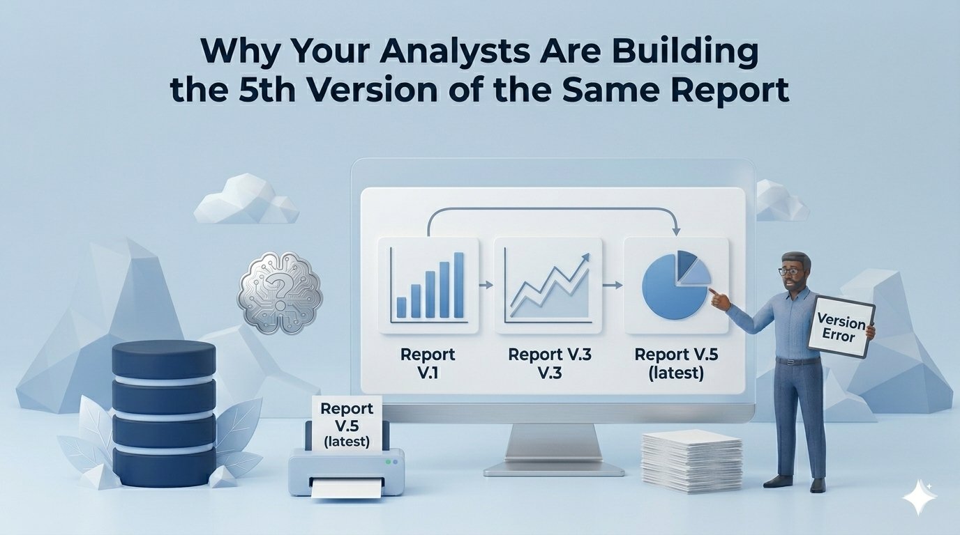
"Hey, is the v3 revenue report the one with the APAC filter, or is that v4?"
That Slack message lands at 9am. Your analyst pauses mid-task, opens a folder with a name like Revenue_Report_Final_v3_USE_THIS_ONE.xlsx, and starts digging. By the time they figure out which version is canonical, thirty minutes are gone and nobody is any closer to an actual decision.
This is not a one-off. It is the daily operating condition of most analytics teams. And if you are wondering why your analysts keep rebuilding the same report, the answer is not that they are disorganized. The answer is structural, and it will keep happening until you change something more fundamental than your naming conventions.
Dashboard anarchy occurs when organizations rely on static reporting tools to answer dynamic business questions. Each new version of a report is not a failure of discipline. It is the natural outcome of a mismatch between the medium and the question being asked. When the tool cannot adapt to the question, the team adapts the tool. Version by version, copy by copy, until no one knows which number is right.
Dashboards promised to solve the reporting problem
When dashboards first rolled out across the organization, they delivered exactly what they promised. One place for the metrics that mattered. Sales, finance, and the executive team all looking at the same numbers. Consistent definitions, consistent cadence, consistent visibility.
Dresner Advisory's 2023 Wisdom of Crowds Business Intelligence Market Study found that business intelligence adoption rates among enterprises have stayed above 80% for years running. Dashboards became the default infrastructure of data-driven organizations, and for stable, recurring, executive-level metrics, they still work.
The problem is that business questions are not stable. They evolve. And dashboards were not built for evolution.
When one dashboard isn't enough anymore
The fragmentation usually starts with something reasonable. The sales team wants revenue broken out by rep. Finance wants it by contract type. Operations needs it filtered by region, with churn excluded from the denominator. Each of these requests is legitimate. Each reflects how a different team actually uses the data to make decisions.
The sensible response, given the tool at hand, is to copy the dashboard and adjust it. A filter here, a metric redefinition there. Now you have three dashboards where there was one, and all three are technically correct for their specific audience.
This is the fork point: the moment a shared dashboard stops being shared. Once a dashboard serves too many stakeholders with incompatible needs, someone clones it. v1 becomes v2. v2 becomes v5. Not because anyone made a bad decision, but because the tool has no mechanism for handling a question that changes shape.
According to Collibra's 2023 State of Data Intelligence report, organizations manage an average of 47 distinct metric definitions across departments, for what they all consider to be the same core business KPIs. That number is the fuel for every v3 your team has ever built.
Duplication is not laziness, it is the rational choice
Here is the part that most conversations about dashboard sprawl get wrong: they treat it as a people problem. Analysts are not duplicating reports because they are cutting corners. They are duplicating reports because the alternative, refactoring a dashboard that is currently in active use, carries significant risk with no visible reward.
If you modify v2 and break something, three teams notice immediately. If you build v3 and add a note in the file name, you ship on time and nobody complains. The rational choice, given those incentives, is always duplication.
Software engineering solved this problem decades ago. Code gets reviewed before it ships. Dependencies get flagged. Functions get deprecated with warnings. There is a cultural and technical infrastructure for retiring old logic without breaking what currently works.
BI has none of this. There is no dashboard pull request. There is no deprecation flag. When a new version of a report is created, the old version does not disappear. It sits in a shared folder indefinitely, waiting to confuse the next person who opens it. Old dashboards never die. They accumulate.
This is how version 2 becomes version 4 becomes version 5. Each edge case adds a copy. Each new data source triggers a fork. Nobody refactors because the refactor is hard, the credit is invisible, and the existing version is "good enough for now." The technical debt compounds exactly like it does in codebases, silently, until the interest payment becomes unbearable. If you are navigating this kind of data bottleneck, the cause is almost always structural, not behavioral.
What dashboard anarchy actually costs the business
The cost shows up in two places: analyst time and decision quality. Both are harder to measure than they should be, which is part of why the problem persists.
The analyst time sink
BARC's 2024 BI Trends Survey found that data professionals spend an average of 44% of their time on data preparation and report maintenance, work that generates no net new insight. Nearly half of the capacity of your analytics team, consumed by keeping existing reports alive.
A food and beverage company working with Lumi AI quantified what happened when they addressed this directly: report development accelerated 20x after moving to conversational analytics. The implicit side of that number is what their analysts were doing before, building, maintaining, and re-explaining the same reports, over and over, in slightly different configurations.
Insights trapped in fragmented systems
Jordan Kuhns, Director of Wholesale Technology Portfolio at GROWMARK, described the core challenge as a combination of fragmented reporting systems and reliance, meaning the answers existed in the data, but accessing them required either a specific person or a specific report that only that person knew how to run.
Statistical analysis that should have been self-service required routing requests to in-house data scientists. Teams waited. Decisions slowed. The data was there; the path to it was not. The full account of how GROWMARK addressed this is worth reading if your team recognizes that pattern.
Chalhoub Group, the largest luxury retailer in the Middle East, identified $60 million in additional revenue opportunities once their data was properly surfaced through Lumi AI. If a subset of easily convertible customers made just one of their annual purchases in-store instead of online, the revenue impact was significant. The question is how many planning cycles passed while the team was reconciling which dashboard version had the right customer segmentation.
Dashboard anarchy is not just an operational frustration. It is a mechanism for burying insight under process.
The real problem: a static tool for a dynamic job
Dashboards are fixed artifacts. They encode a question at a specific point in time, this metric, this filter, this level of aggregation, and they hold that shape indefinitely. That works when the question is stable.
Business questions are not stable. They shift with the quarter, with the product launch, with the market move, with the thing the CFO asked in Tuesday's meeting. Every time a question evolves, a static dashboard requires a new version or a new copy. The gap between what the tool can do and what the business needs keeps widening.
Not every question belongs on a dashboard
The right heuristic: stable, recurring, executive-level metrics belong on a dashboard. Monthly revenue by region, weekly inventory turns, quarterly churn, these are well-defined questions with well-defined answers, and a dashboard serves them well.
Situational, exploratory, and one-time analytical questions should never have been dashboards in the first place. "Which stores in the Northeast are underperforming on sell-through relative to comparable stores from last year, excluding the two that were closed for renovation?" is not a dashboard question. It is an investigation.
The governance playbook and its ceiling
Data catalogs, ownership tagging, dashboard deprecation policies, these tools have real value. They slow the accumulation, create accountability, and make it easier to find the authoritative version of a report when it exists.
But governance cannot close a structural mismatch. You can tag every dashboard in your environment with an owner and a review date, and you will still end up with seventeen versions of the revenue report. Because the pressure that creates those versions, dynamic questions colliding with a static medium, does not go away when you add metadata. The tool is still the wrong tool for that class of question. Teams evaluating alternatives to their current BI stack often find this framing clarifying when comparing platforms built for static reporting against those built for conversational querying.
Where investigation replaces versioning
When the medium matches the question, versioning stops. Not because of better process, but because the need for a new version never arises.
The questions that generate the most dashboard copies, the situational, exploratory, one-time analyses, are exactly the questions Lumi AI is built to answer. Instead of encoding an investigation into a static report and saving it as v3, analysts ask the question directly against live data and get a precise answer on demand. The insight surfaces. The decision gets made. No artifact to name, store, or reconcile later.
This matters most when the stakes are high. The organizations that find the most value in this model are not the ones optimizing routine reporting. They are the ones trying to answer questions with real revenue implications: which customer segments are underperforming, where demand is going unfulfilled, which operational patterns are quietly costing margin. Those are investigation questions, not dashboard questions. And the ROI of answering them quickly and accurately, without a two-week report-building cycle, tends to be significant.
Lumi AI's Enterprise Pilot lets large organizations run that model in a controlled project before wider deployment, connecting to existing data infrastructure and letting teams ask the questions that matter directly, instead of waiting for the next report version.
Frequently asked questions
What is dashboard anarchy and what causes it?
Dashboard anarchy is the state that results when organizations use static reporting tools to answer dynamic business questions. As questions evolve and different teams need different cuts of the same data, teams create new versions of existing reports rather than modify shared ones. Over time, the organization accumulates dozens of report copies with overlapping definitions, unclear ownership, and no deprecation mechanism, leaving no one certain which version reflects ground truth.
Why do analytics teams create duplicate reports instead of updating existing ones?
Modifying an existing report that is in active use carries real risk: if something breaks, multiple teams notice immediately. Creating a copy carries almost no risk. It ships quickly and the original remains intact. Given those incentives, duplication is the rational choice. BI environments compound this because there is no equivalent of code review or deprecation flagging, so old reports never get formally retired and accumulate indefinitely.
How can companies reduce the time analysts spend on report maintenance?
The most direct path is changing the medium for the right class of questions. Stable, recurring metrics belong in governed dashboards. Situational, exploratory, and one-time questions should be handled through conversational analytics, where the question is asked directly in natural language and answered against live data, with no report artifact to maintain afterward. A shared semantic layer that governs KPI definitions centrally removes the metric fragmentation that drives most duplication. Lumi AI's platform combines both: natural language querying against a governed knowledge base, so each question gets an accurate answer on demand rather than a new dashboard copy.
What is the difference between dashboard sprawl and dashboard anarchy?
Dashboard sprawl refers to the quantity problem, too many dashboards, most of which go unused. Dashboard anarchy is the trust problem that follows: when there are enough versions of the same report that no one is certain which one is authoritative, the organization loses its ability to make decisions from a shared set of facts. Sprawl is the symptom; anarchy is the consequence.
Does better data governance fix the versioning problem?
Governance helps but cannot solve it. Data catalogs, ownership tags, and review cadences slow the accumulation and create accountability. But if the underlying tool is still a static dashboard and the underlying questions are still dynamic, the pressure that creates new versions does not disappear. It just gets better labeled. Closing the gap requires changing the medium for the questions that dashboards were never the right tool to answer.
Lumi AI's Enterprise Pilot lets large organizations run that model in a controlled project before wider deployment, connecting to existing data infrastructure, applying a governed semantic layer, and letting teams ask questions directly instead of waiting for the next report version. If your analysts are building the seventeenth version of the same report, that is the signal that the process has outgrown its tooling.

Data & AI Products | Founder & CEO at Lumi AI | Ex-Director at Unicorn. Ibrahim Ashqar is the Founder and CEO of Lumi AI, a company at the forefront of revolutionizing business intelligence for organizations with a specialization in the supply chain industry. With a deep-rooted passion for democratizing data access, Lumi AI seeks to transform plain language queries into actionable business insights, eliminating the barriers posed by SQL and Python skills.
Related articles
The New Standard for Analytics is Agentic
Make Better, Faster Decisions.