AI & Analytics
What Happens When You Have Too Many Dashboards (And Can't Find Any Answers)

The revenue number on the first dashboard read $4.2 million. The second dashboard showed $3.9 million. Same quarter. Same metric. Different answers.
This article explains why, shows you where your organization sits on the curve, and points to the only fix that actually holds.
The More Dashboards You Build, The Less You Actually Know
Self-serve BI was supposed to democratize data. Give every team access to their numbers without waiting on analysts. Build a culture where decisions get made on evidence, not instinct. For a while, it worked.
The first wave of dashboards generated real value. Sales tracked pipeline. Operations monitored fulfillment rates. Finance watched margins. Teams made better calls because the data was finally visible.
Then the requests kept coming. New dashboards for new questions. New views for new stakeholders. And because retiring old dashboards was nobody's job, the library kept growing.
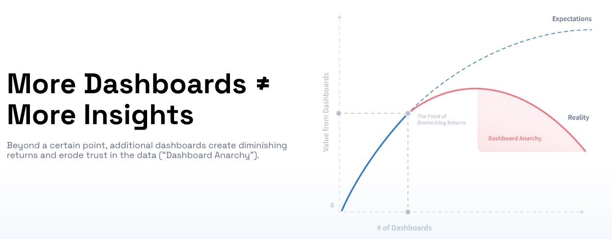
At some point, and every organization hits this point, the curve bends. The value of each new dashboard drops. Then it goes negative.
Industry data consistently shows that the majority of dashboards in enterprise BI environments are rarely or never viewed after their first month. The dashboards don't disappear. They accumulate. And accumulation is exactly the problem.
What is Dashboard Anarchy?
Dashboard Anarchy is the state that occurs when an organization's number of dashboards exceeds its capacity to govern, trust, or act on them, resulting in conflicting metrics, eroded data confidence, and business users who've quietly stopped believing the numbers. It's not a storage problem. It's a trust collapse.
Dashboard Anarchy doesn't happen because someone made bad decisions. It happens because everyone made reasonable ones, and the system has no natural ceiling.
A BI tool rolls out. The first dashboards are genuinely useful. Stakeholders ask for more. The data team builds them. Value keeps climbing. Then the platform adds self-serve features, and non-technical users start building their own views.
Nobody retires the old dashboards, that would require knowing which ones are still being used, by whom, and whether anything downstream depends on them. That audit never happens, because it's unglamorous work with no obvious owner.
Then two dashboards show different numbers in the same meeting. Someone from finance trusts one source. Someone from operations trusts another. Neither backs down, because neither is wrong about what their dashboard says.
Jordan Kuhns, Director of Wholesale Technology Portfolio at GROWMARK, one of North America's largest agricultural cooperatives, described exactly this state before the organization changed its approach. The problem wasn't a lack of data. It was fragmented reporting systems and a dependence on tribal knowledge, meaning the people who understood which reports to trust, and why, were the system. When those people weren't in the room, the data couldn't speak for itself.
That's what Dashboard Anarchy looks like at scale.
You've Hit Dashboard Anarchy If You Recognize Any of These
The clearest way to locate your organization on the curve is to look for the symptoms. They show up in meetings, in Slack channels, in the queue of your data team. Here's what they actually look like.
"Which one is the source of truth?"
The same KPI, revenue, conversion rate, inventory turn, appears in multiple dashboards with slightly different values. Each was built by a different team, using slightly different logic, pulling from slightly different data cuts. All of them are defensible. None of them is definitive.
Meetings that should take twenty minutes now take an hour because the first fifteen minutes go to reconciling which number is correct. The decision gets made eventually, but the data's authority has been quietly undermined.
The person who built it doesn't work here anymore
Go into your BI tool and pull up the five dashboards accessed least recently. Odds are strong that the creator has left the organization. The dashboard still runs. It still gets referenced in presentations. Nobody knows if the underlying logic is still valid or if the data source it pulls from has since been restructured.
Your data team is a reporting factory, not an insights engine
The team that was hired to find signals in the data now spends the majority of its time building, maintaining, and explaining dashboards. New requests come in faster than old ones get retired. Strategic analysis, the work that actually surfaces opportunities, keeps getting deprioritized because the ticket queue won't clear.
This is the most expensive symptom, because it's invisible in headcount reports. The team is fully utilized. They're just not doing what they were hired to do.
Business users have gone back to Excel
Watch where decisions actually get made. If the answer is in a spreadsheet that someone built themselves, pulling exports from the BI tool and reformatting them manually, the self-serve analytics experiment has failed in the most visible way possible.
People don't abandon BI tools because they prefer spreadsheets. They abandon them because the BI tool stopped giving them answers they trust.
Nobody questions the dashboard anymore, they just ignore it
The Real Cost Isn't Confusion, It's the Decisions You Didn't Make
The problem with pre-built views is that they answer pre-built questions. They aggregate, they average, they smooth out the texture of the data to make it navigable. That's useful when the question is known in advance. It's a liability when the signal lives in the variance.
When Kroger worked with Lumi AI to analyze fulfillment performance, the insight required de-averaging the data down to the store-item level, granularity no dashboard was configured to show. The result was 1.2 million units in unfulfilled demand that had been invisible inside the aggregated view. The data was always there. The dashboard structure was hiding it.
The same pattern emerged at Chalhoub Group, the largest luxury retailer in the Middle East. Analyzing purchase behavior at a level of specificity that pre-built dashboards don't support, the team identified $60 million in additional revenue opportunities, customers with clear conversion potential who would generate significantly more value with one in-store purchase per year instead of online only.
The question every organization should ask is not "how many dashboards do we have?" but "what are our dashboards structurally incapable of showing us?" The answer is almost always more expensive than the cost of fixing it.
Why "Just Consolidate Your Dashboards" Doesn't Fix the Problem
The standard prescription for Dashboard Anarchy is a dashboard audit: identify the redundant views, retire the unused ones, establish governance rules, assign ownership. Do this every quarter. It's good advice. It also doesn't work.
Consolidation is a one-time event. Dashboard proliferation is a continuous force. Every new business question, every new team, every new stakeholder with access to self-serve features generates new dashboards. Unless the underlying demand for new views stops, which it won't, because the underlying demand is for answers, consolidation just resets the clock.
Governance frameworks have the same problem. They require organizational will that is almost never sustained. Who decides which dashboard gets retired? Who owns the approval process for new ones? In most organizations, nobody does, not because people are irresponsible, but because governance is overhead with no visible return until it breaks.
The deeper problem is the assumption neither consolidation nor governance questions: that dashboards are how business users should get data.
That assumption made sense when the alternative was writing SQL or waiting for an analyst. It made sense when the question was known in advance and a pre-built view could answer it reliably. It makes less sense now that GROWMARK's teams can perform statistical analysis that previously required in-house data scientists, through a plain-language conversation with their data, without a single dashboard involved.
Consolidation manages the symptom. The question worth asking is whether the underlying model needs to change.
What Comes After the Dashboard
The dashboard was invented to solve a specific problem: giving non-technical users access to data without requiring them to write code. It was the right solution for that constraint. It isn't the only solution anymore.
Natural language analytics changes the underlying equation. Instead of navigating a library of pre-built views hoping one answers the current question, a business user asks the question directly. The analysis is generated for that question, not built weeks earlier in anticipation of it.
This isn't a marginal improvement on self-serve BI. It's a different model. The dashboard assumed that useful questions could be predicted in advance and pre-answered at scale. Conversational analytics assumes questions are dynamic, contextual, and specific, and builds the answer at the moment of asking.
A food and beverage company using Lumi AI accelerated report development by 20x using this model. The constraint wasn't analytical capability. It was the time between having a question and getting an answer. A textile manufacturer reduced procurement costs by 38% by surfacing cost-saving opportunities in raw material purchasing, the kind of specific, ad hoc analysis that no pre-built dashboard was ever going to generate on its own.
What makes this work at enterprise scale isn't just the natural language interface. It's the semantic layer underneath, a knowledge base where organizations define their own business terms, KPIs, and data logic, so the AI answers in the company's own language rather than generic database terms. The system understands what "sell-through" means to a specific retailer, what counts as an "at-risk order" to a specific manufacturer, what "fulfillment rate" means after the supply chain was restructured in Q2.
That specificity is what separates an answer from a number.
Frequently Asked Questions
How many dashboards is too many?
There's no universal threshold. The line isn't a number, it's a ratio. When your organization's dashboard count exceeds your capacity to govern, own, and trust them, you've crossed it. The clearest test: ask five people in a meeting which dashboard is authoritative for a key metric. If the answers differ, the threshold is already behind you.
What are the early warning signs of Dashboard Anarchy?
The most reliable signals are behavioral, not numerical. Watch for meetings that stall on data reconciliation, a data team backlogged with ad hoc requests instead of doing strategic analysis, and business users who've quietly returned to Excel for decisions they trust. Any one of these is a warning. All of them together means the trust collapse is already underway.
Is dashboard consolidation enough to fix Dashboard Anarchy?
Consolidation helps but doesn't hold. It removes existing debt without changing the rate at which new debt accumulates. Organizations that have structurally resolved Dashboard Anarchy have typically shifted the access model, moving from pre-built views that anticipate questions to conversational interfaces that answer them directly, eliminating the proliferation cycle rather than managing it.
Which teams are most exposed to Dashboard Anarchy?
Supply chain, retail operations, and finance teams are disproportionately affected. Their data environments are high-volume, multi-source, and fast-changing, conditions that accelerate dashboard sprawl faster than governance can contain it. These are also the teams where decision latency is most expensive, which makes the cost of Dashboard Anarchy concrete rather than theoretical.
Can natural language analytics replace dashboards entirely?
For most ad hoc and investigative analysis, yes. For real-time operational monitoring where a known metric needs to be watched continuously, dashboards still have a role. The practical shift is narrowing dashboards to what they're actually good at, persistent monitoring of known KPIs, and handling everything else through direct querying. That combination eliminates the proliferation problem because the pressure to build new dashboards for new questions disappears.
Where Do You Go From Here?
The organizations getting ahead of Dashboard Anarchy aren't building fewer dashboards and hoping governance holds. They're changing the question from "which dashboard has the answer?" to "let me just ask."
If your data team is buried, your meetings are stalling on reconciliation, and your business users are working in Excel, the infrastructure isn't the problem. The model is.

Data & AI Products | Founder & CEO at Lumi AI | Ex-Director at Unicorn. Ibrahim Ashqar is the Founder and CEO of Lumi AI, a company at the forefront of revolutionizing business intelligence for organizations with a specialization in the supply chain industry. With a deep-rooted passion for democratizing data access, Lumi AI seeks to transform plain language queries into actionable business insights, eliminating the barriers posed by SQL and Python skills.
Related articles
The New Standard for Analytics is Agentic
Make Better, Faster Decisions.